


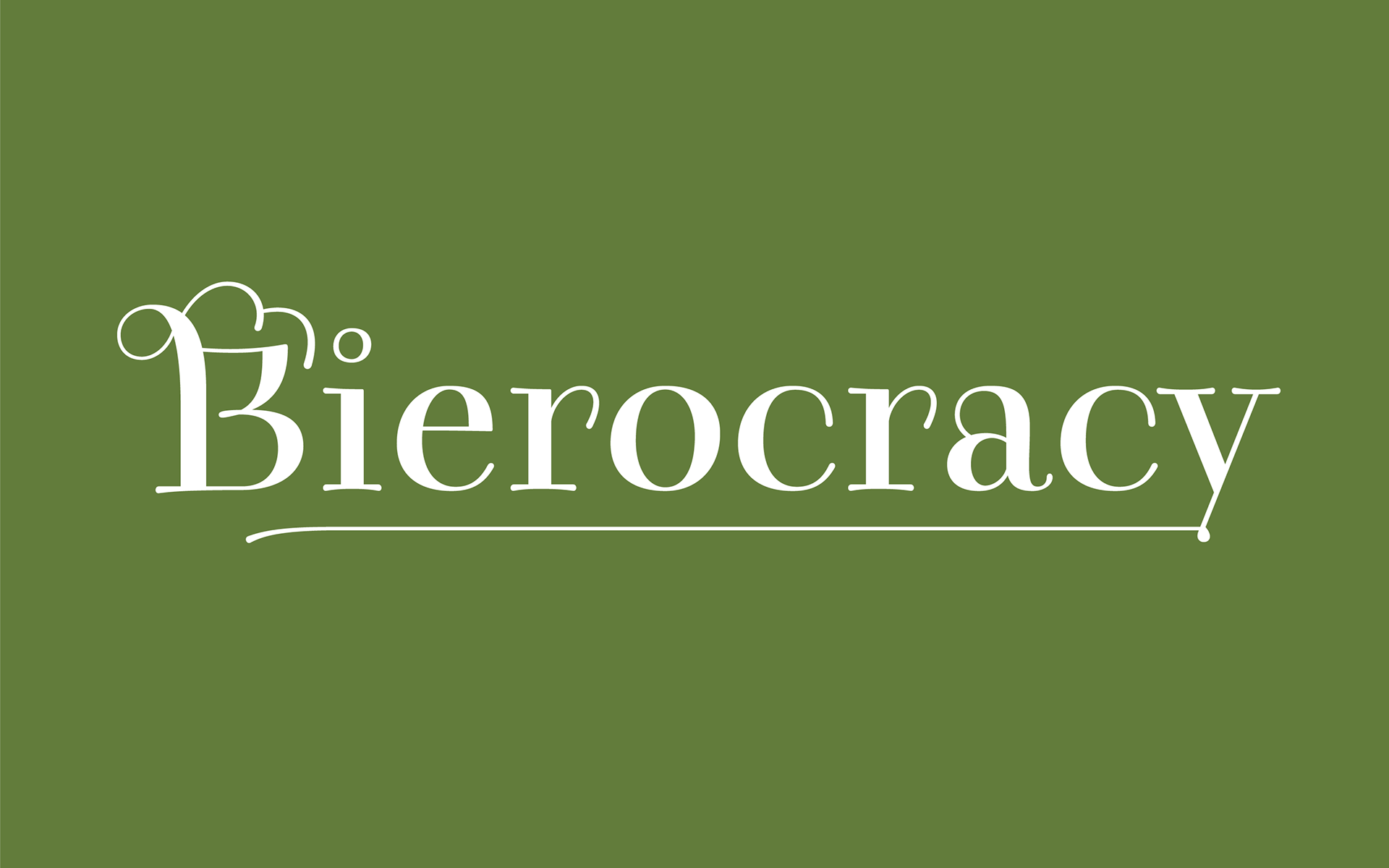
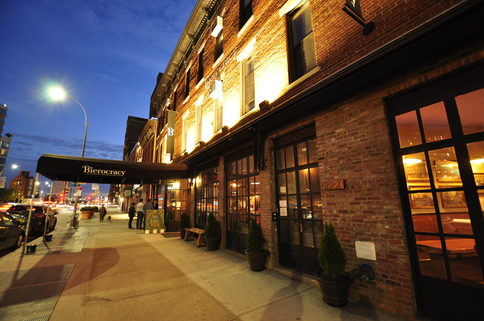
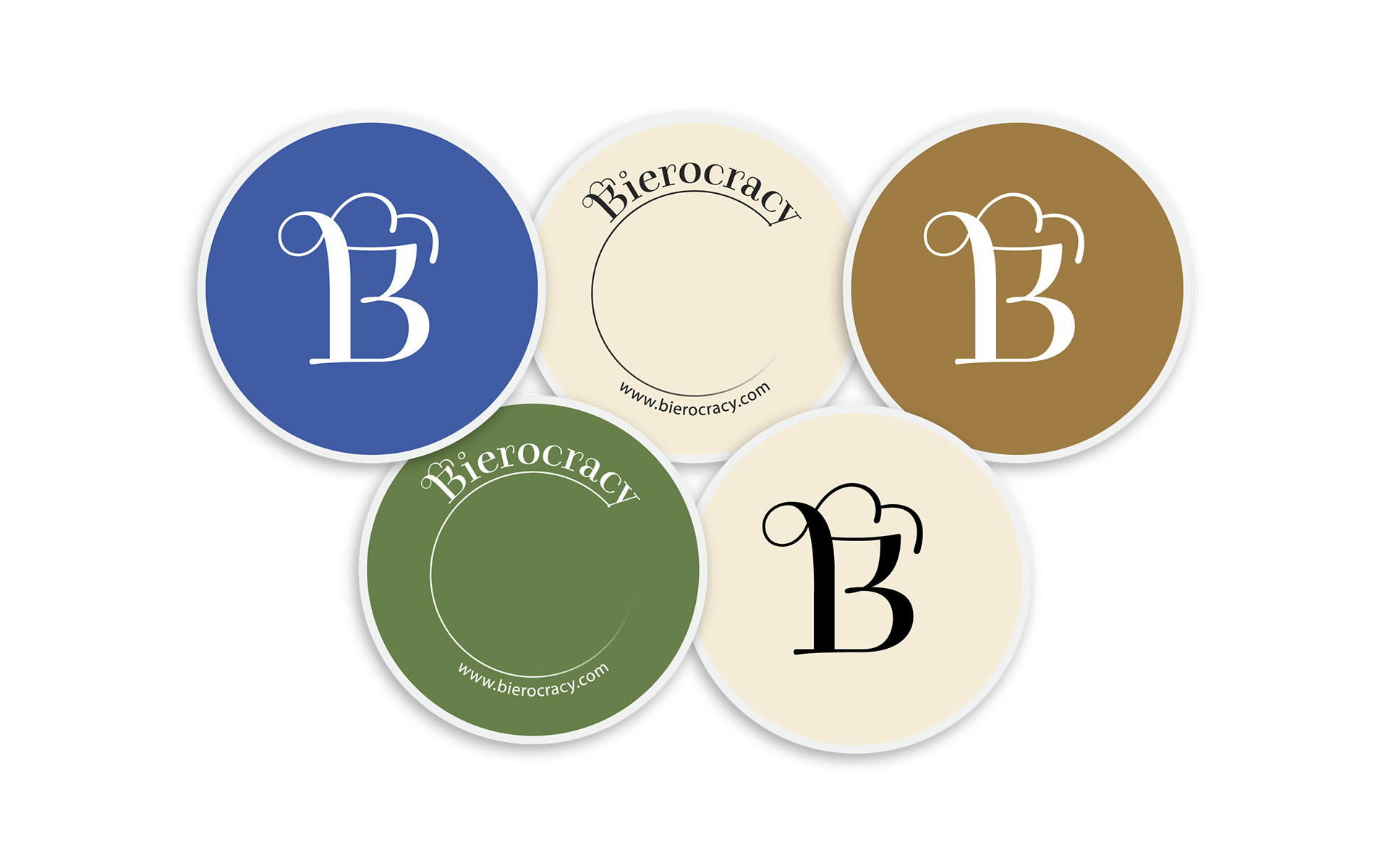
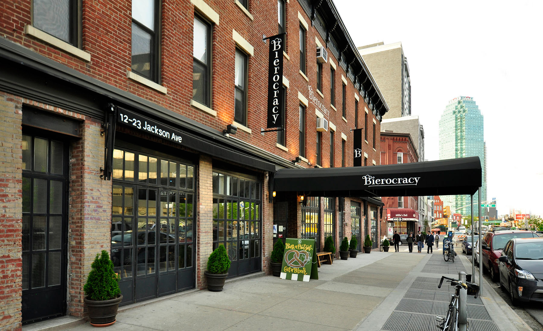
Vizuální identita newyorské restaurace nabízející široký sortiment evropských piv, 2017.
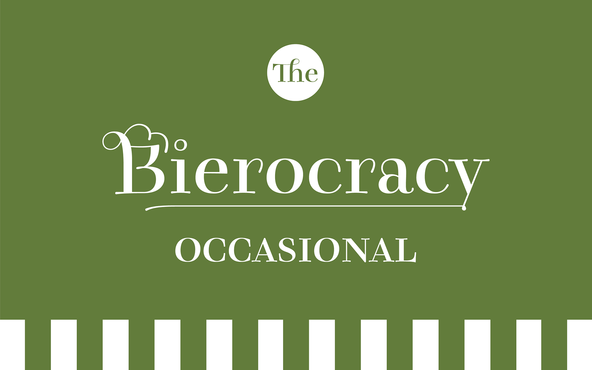
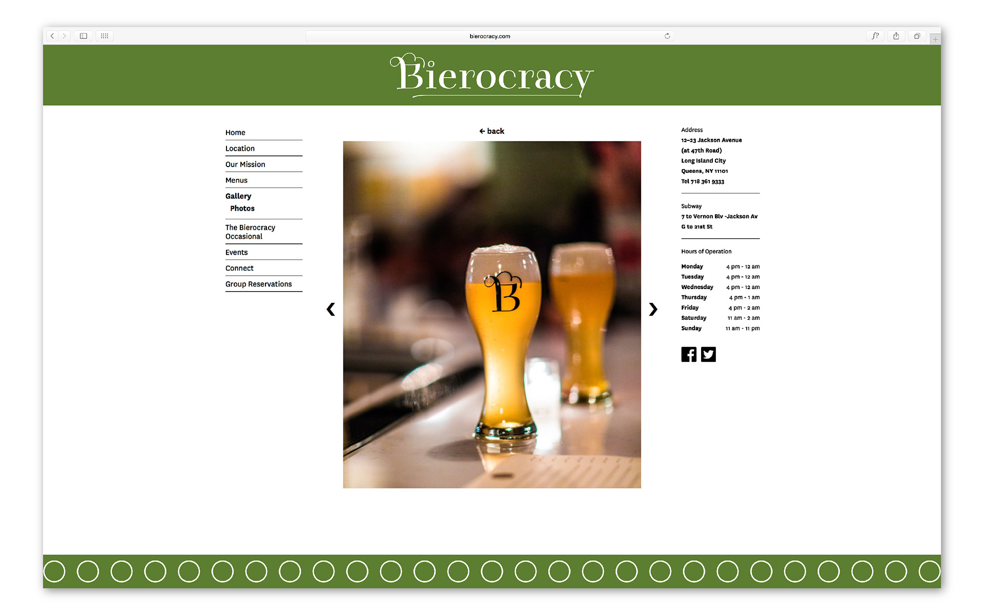
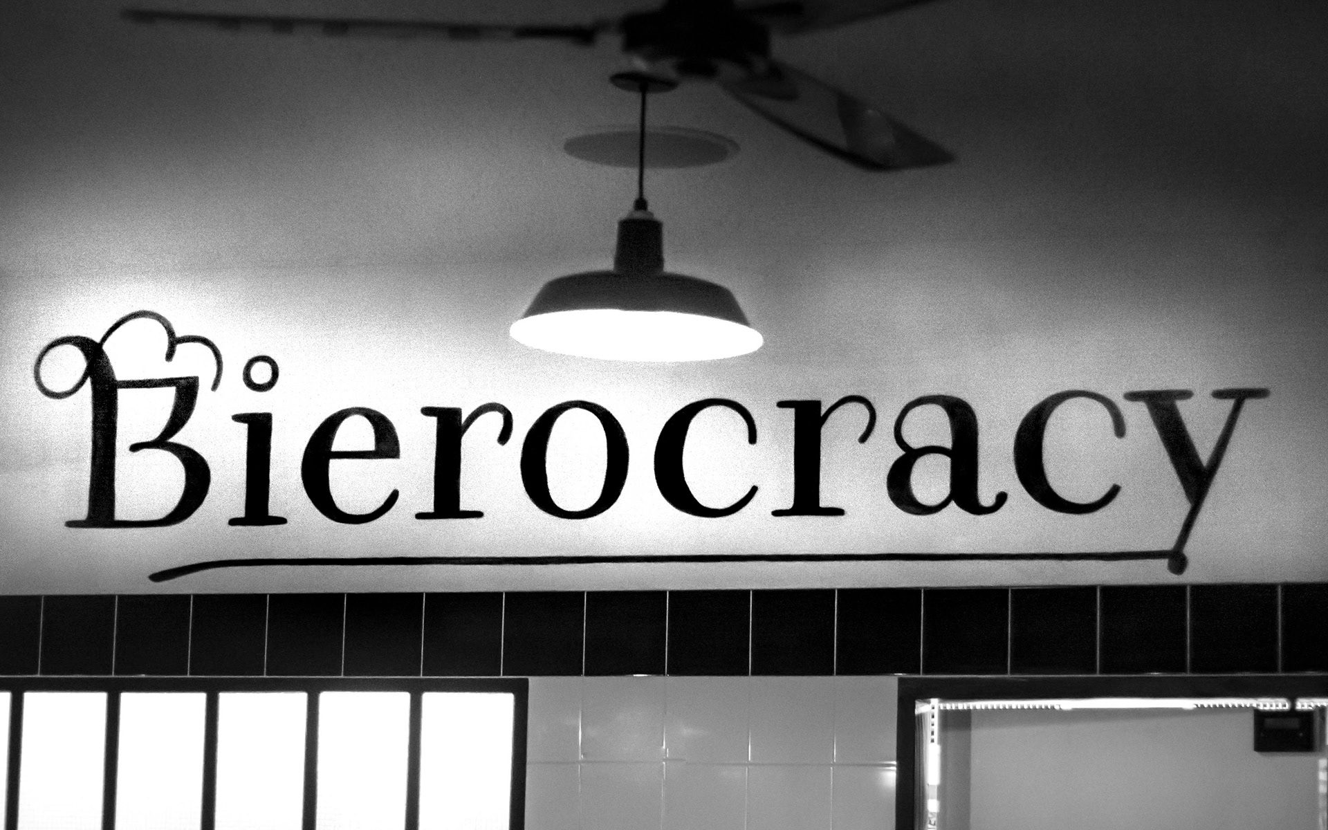
Vizuální identita newyorské restaurace, která nabízí široký výběr středoevropských piv. Logotyp je založen na kombinaci statické antikvy a úřednického Kurrentschriftu, koncept restaurace potom na satirické iluzi, že během vysedávání u piva lze svrhnout monarchii a vybudovat demokracii. Odtud „bierokracie“.
The visual identity of a New York based restaurant that offers a whole plethora of beers imported from Central Europe. The logotype is a combination of two typefaces – a static Antiqua and the Kurrentschrift. The whole concept of the establishment is then based on the satirical thought that you can overthrow a monarchy and install democracy just by sitting around drinking beer. Hence Bierocracy!